ITALBALKANIKA / MEDIA & EDITORIAL IDENTITY
A voice between
Italy and the Balkans.
A clear identity system for ItalBalkanika, connecting its editorial voice with a recognisable visual world.
The overview.
ItalBalkanika connects Italy and the Balkans through news, analysis and editorial content. Its identity needed a consistent visual language across the brand’s business and editorial communications.
The nested geometric mark, navy foundation and Italian green, white and red create a connected system for the logo, stationery, company profile and digital brand applications.
WHAT WE CREATED
Logo & visual identity
Brand guidelines
Stationery design
Company profile design
Digital brand applications
Client / ItalBalkanika
Sector / Media & publishing
Brand design / PROMOS Branding
01 / A DISTINCTIVE FOUNDATION
One identity.
Many expressions.
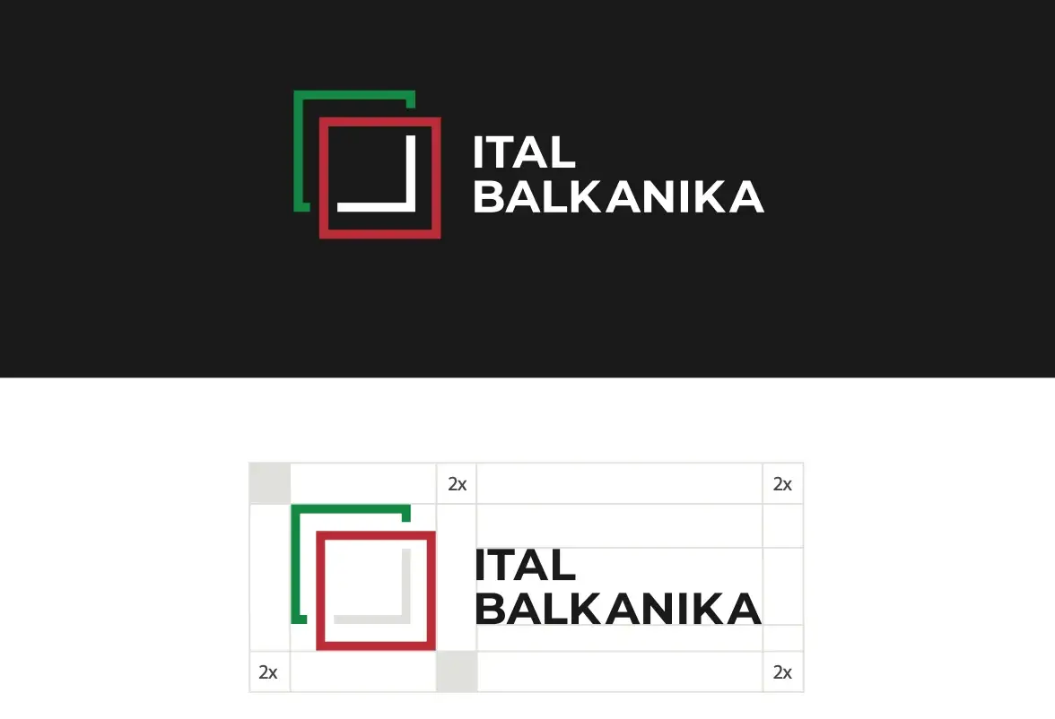
The mark adapts across navy and white backgrounds, while its geometry becomes a recognisable graphic language for branded materials.
02 / THE STORY ON PAPER
A story with
a clear structure.
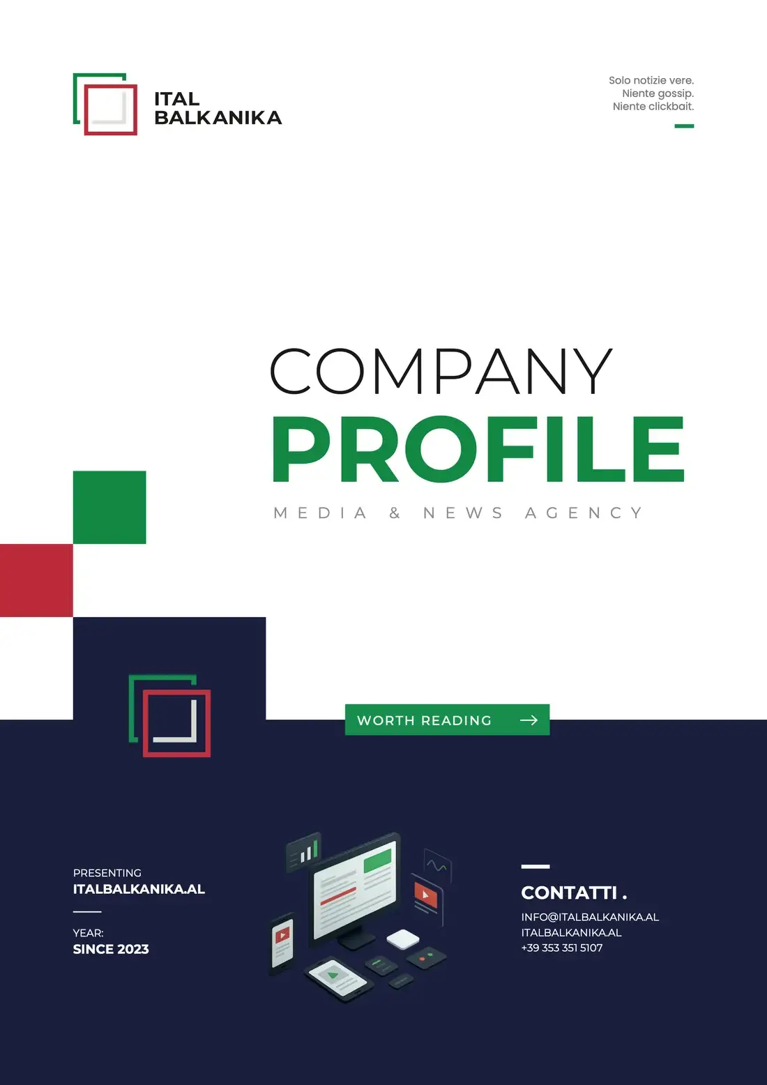
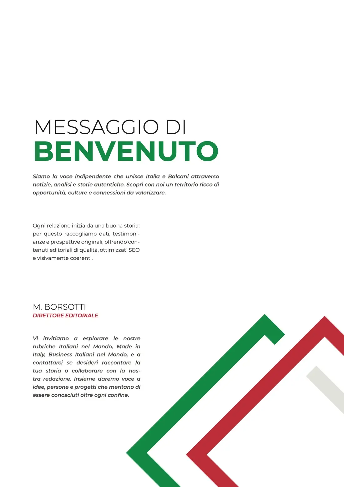
The company profile translates the identity into an editorial format: a strong cover, clear hierarchy, and consistent use of the brand’s geometry and colours.
03 / THE IDENTITY ON SCREEN
One world,
across every format.
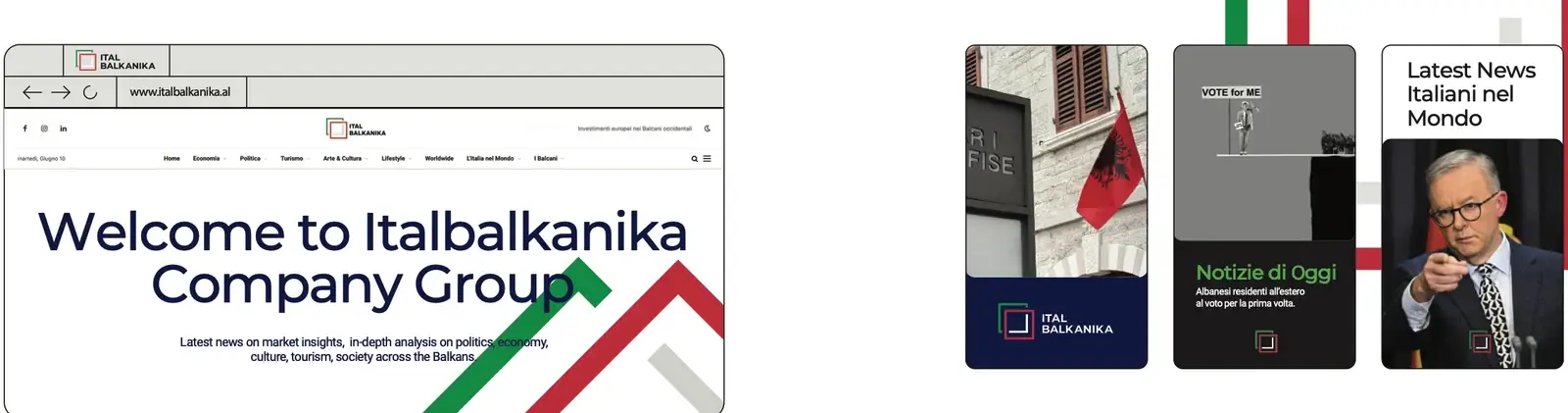
The guidelines extend the same identity into website and social layouts, so editorial content remains recognisable across different screens and formats.