AECA / ALBANIAN E-COMMERCE ASSOCIATION
A connected world.
A distinctive identity.
A geometric identity and a vivid visual language for the Albanian E-commerce Association.
The overview.
The AECA identity brings together a geometric cube, a distinctive wordmark and a bright gradient palette. The visual system connects the association’s name with a recognisable symbol across brand applications and social content.
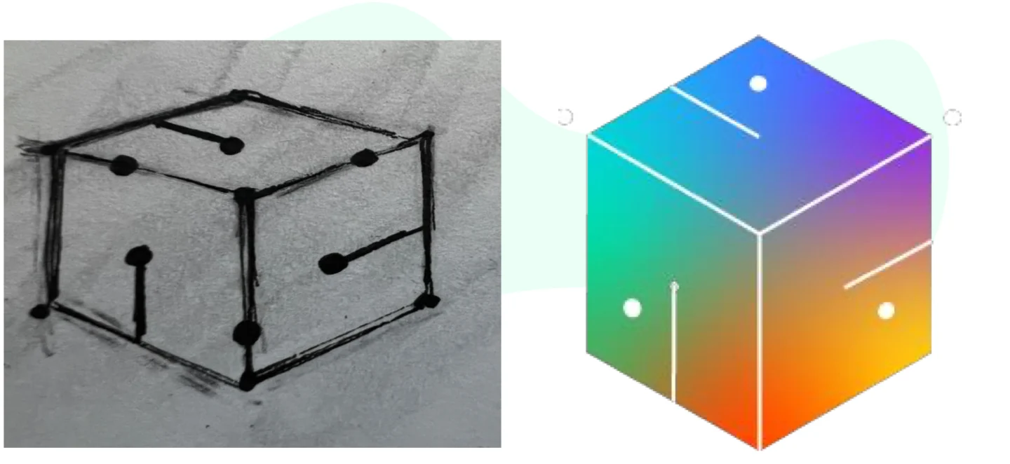
This case study follows the mark from its original sketch to its visual applications.
WHAT WE CREATED
Logo design
Visual identity
Brand applications
Social content design
Client / AECA
Sector / E-commerce association
Identity design / Krisli Sala
Original presentation / Ask Digital Agency
01 / A DISTINCTIVE FOUNDATION
From a sketch
to a signature.
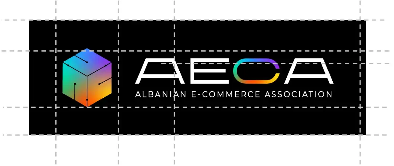
A connected cube and gradient colour give the symbol a clear presence. Construction guides show the relationship between the mark and the wordmark.
02 / AN IDENTITY IN USE
Designed to
be recognised.
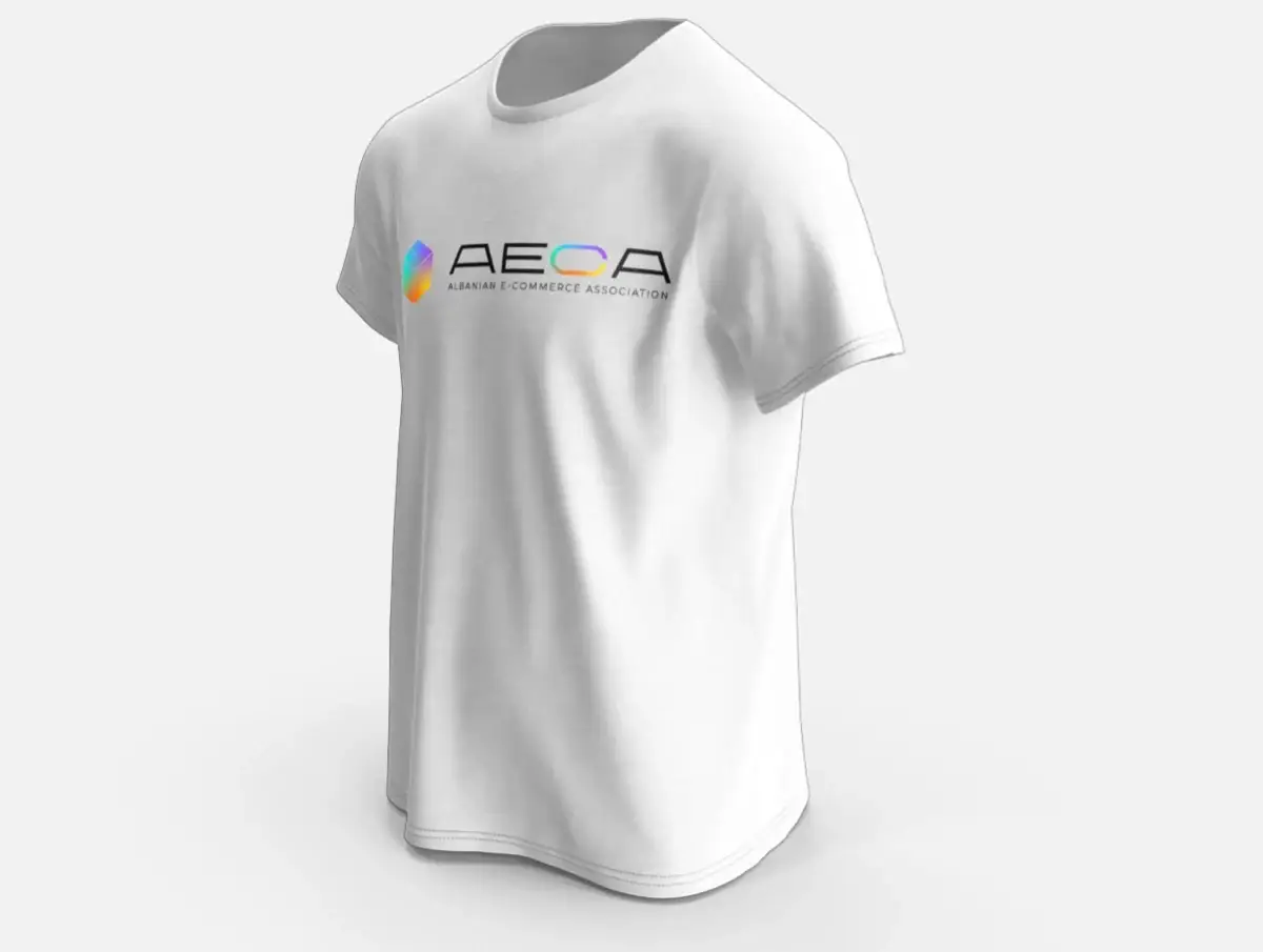
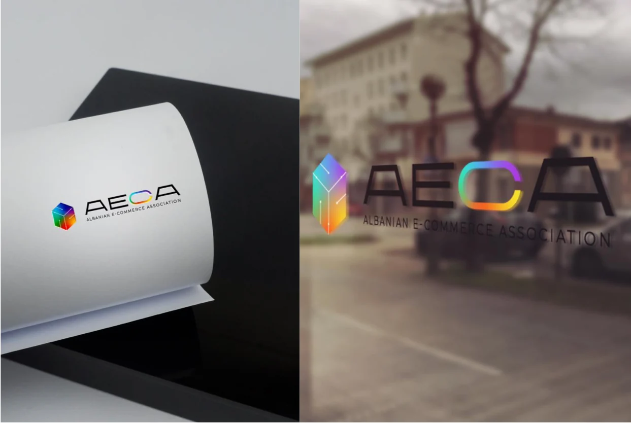
The same visual identity carries across print, signage and apparel. The presentation mockups show how the mark can work in different physical settings.
03 / COLOUR IN COMMUNICATION
A visual language
with range.
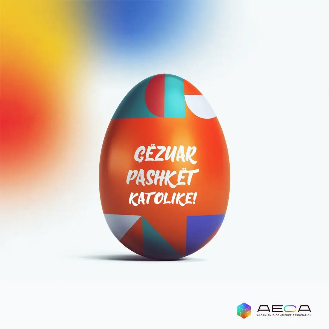
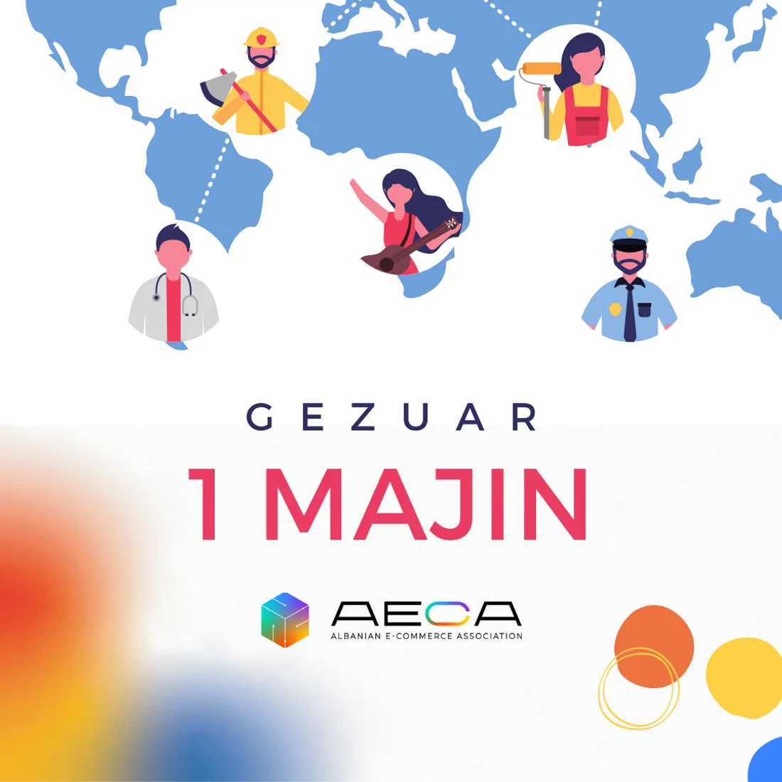
Seasonal social designs bring the association’s identity into celebratory messages, with the gradient palette and logo connecting each piece.