PROMOS®

ITALBALKANIKA / MEDIA & EDITORIAL IDENTITY

A voice between
Italy and the Balkans.

A clear identity system for ItalBalkanika, connecting its editorial voice with a recognisable visual world.

ItalBalkanika logo in Italian green, white and red on navy blue

The overview.

ItalBalkanika connects Italy and the Balkans through news, analysis and editorial content. Its identity needed a consistent visual language across the brand’s business and editorial communications.

The nested geometric mark, navy foundation and Italian green, white and red create a connected system for the logo, stationery, company profile and digital brand applications.
WHAT WE CREATED

Logo & visual identity
Brand guidelines
Stationery design
Company profile design
Digital brand applications

Client / ItalBalkanika
Sector / Media & publishing

Brand design / PROMOS Branding

01 / A DISTINCTIVE FOUNDATION

One identity.
Many expressions.

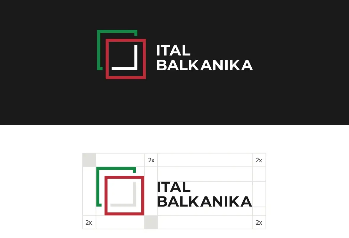
The mark adapts across navy and white backgrounds, while its geometry becomes a recognisable graphic language for branded materials.

ItalBalkanika logo variations on navy and white backgrounds
ItalBalkanika navy stationery presentation mockup with folder, letterhead and business cards

02 / THE STORY ON PAPER

A story with
a clear structure.

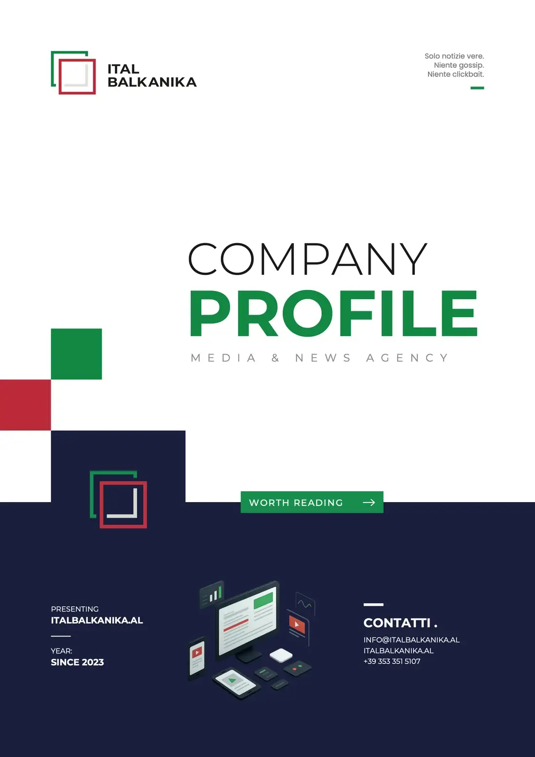
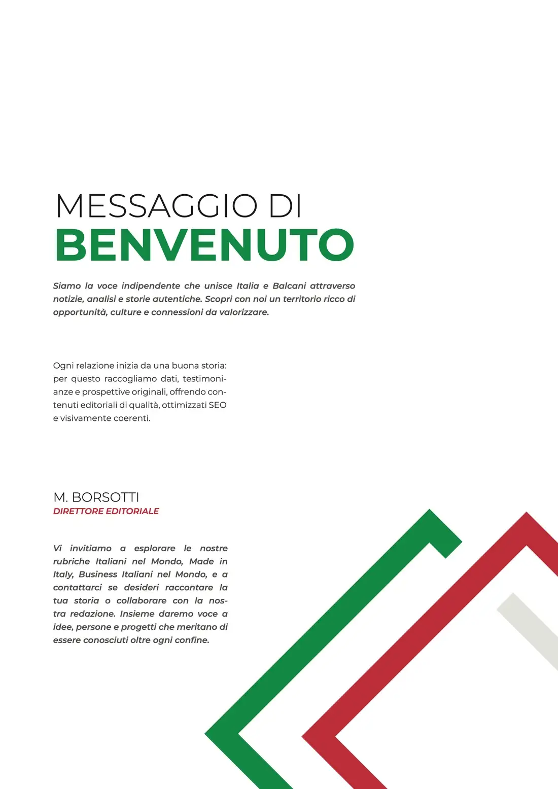
The company profile translates the identity into an editorial format: a strong cover, clear hierarchy, and consistent use of the brand’s geometry and colours.

ItalBalkanika company profile cover designed by PROMOS
ItalBalkanika company profile introduction and geometric brand motif

03 / THE IDENTITY ON SCREEN

One world,
across every format.

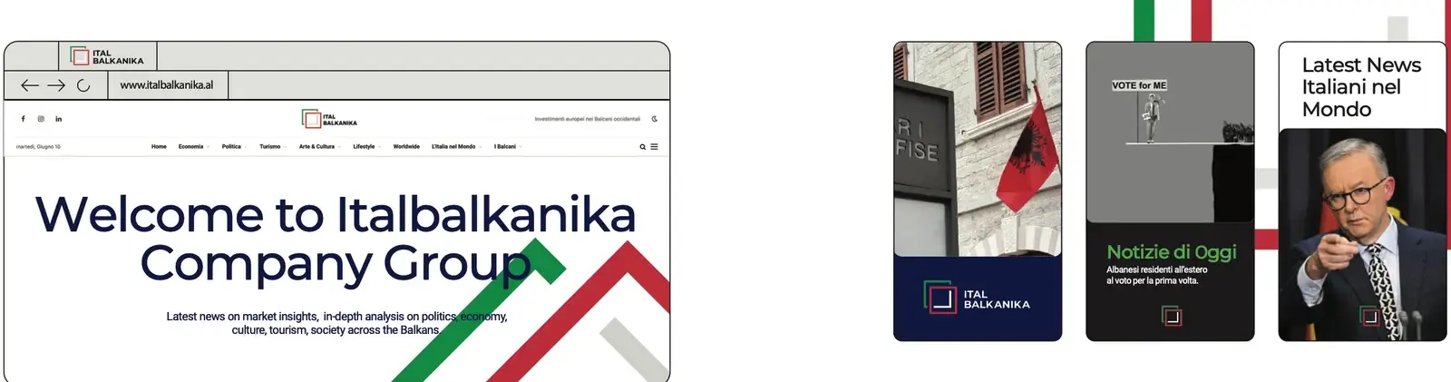
The guidelines extend the same identity into website and social layouts, so editorial content remains recognisable across different screens and formats.

ItalBalkanika website and social identity applications from the brand guidelines

YOUR NEXT CHAPTER / PROMOS

Let’s make your
brand matter.