MRS
Brand identity / Campaigns
A visual identity and brand world for Medical Rapid Solutions. The work spans optical campaigns, product imagery, printed materials, and digital presentation.
PROMOS × MRS / Brand guidelines
A brand,
in full focus.
A closer look at the identity we created for MRS. From the first mark to a complete visual world.
Open original PDF 20 pages · 37 MB ↗Built to be
recognized.
Logo, color and typography.
One connected identity.
From identity
to experience.
A system that moves between
physical and digital spaces.
The complete edition / 20 pages
Explore the
whole brand world.
Use the arrows or swipe to browse. Tap a page above to see it in detail.
Brand identity / Optical & healthcare
A visual system for MRS Optical.
Medical Rapid Solutions works in optical lenses and professional equipment. PROMOS developed a visual identity and documented how it can be used across the brand’s printed and digital communications.
The design direction
The identity brings together a clean logotype, blue color palette and readable typography. The aim of the design direction is to communicate precision and professionalism while keeping the brand approachable. Rather than treating the logo as a standalone asset, the guidelines show how the same visual language carries across different applications.
What the identity system includes
The brand guidelines document the logotype, alternative logo versions, colors and typography. The palette pairs French Blue (#1E72B8) and Picton Blue (#39A8DF) with dark gray and white. Ubuntu and Poppins form the typography system. Logo variants show how the identity adapts to white and blue backgrounds.
Applications and brand presentation
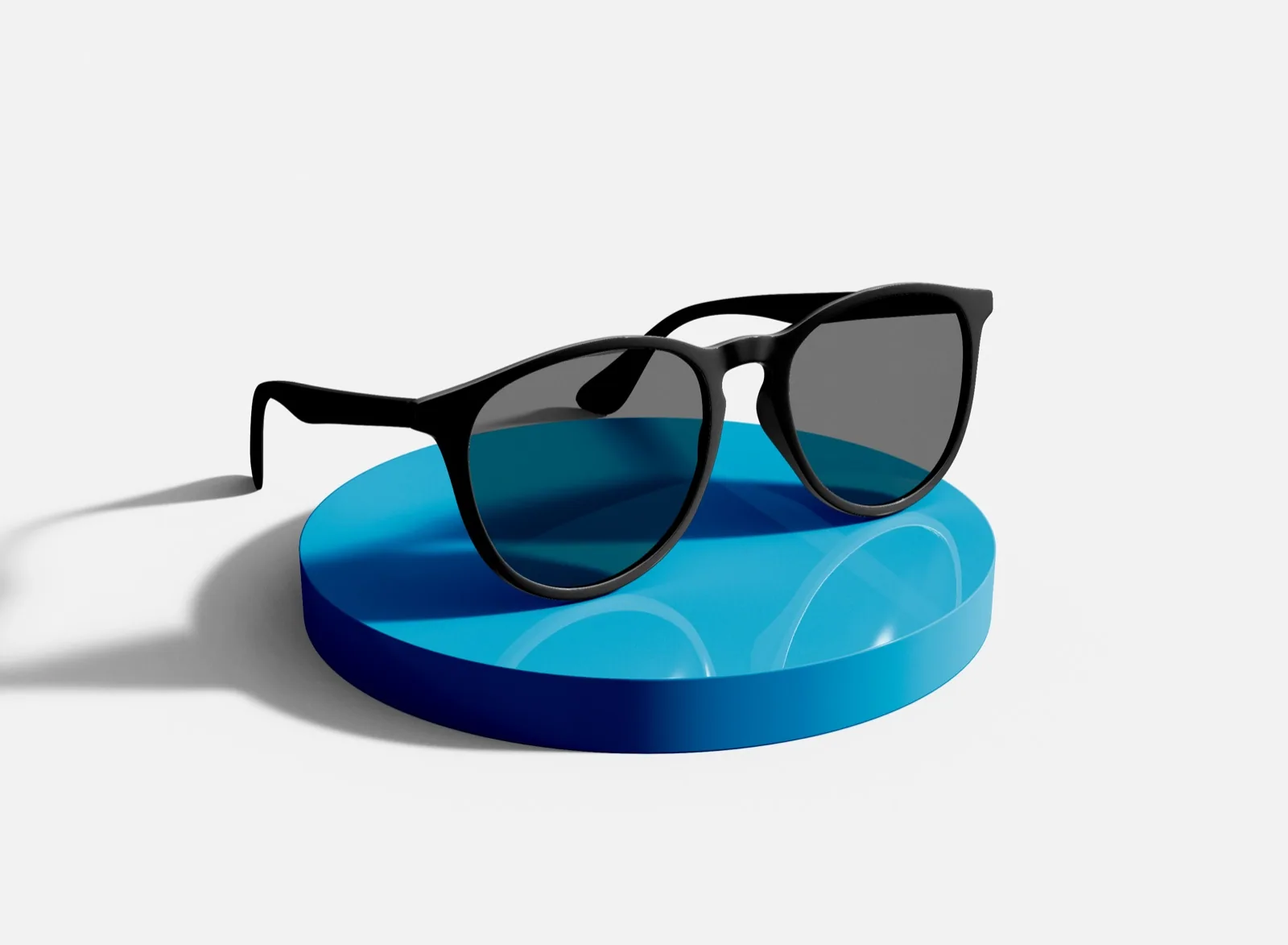
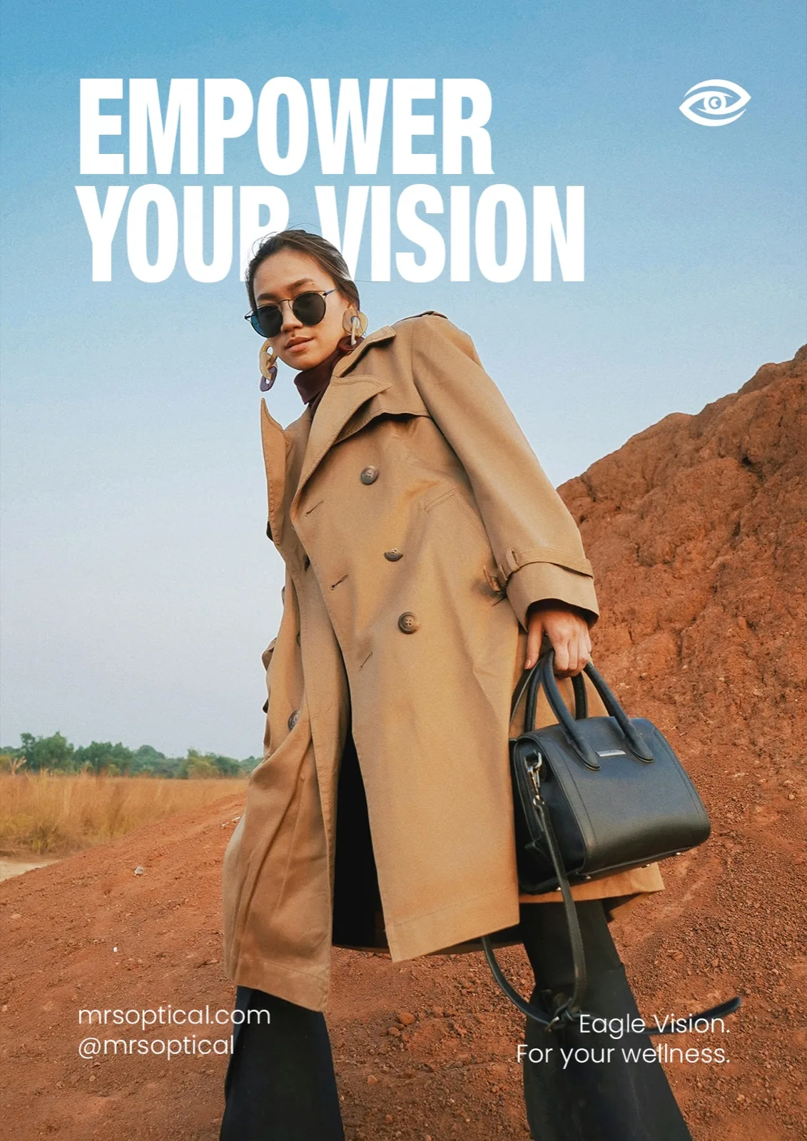
The supplied project presentation shows the identity applied to business cards, indoor signage, eyewear packaging, a branded flag and a website mockup. It also includes social media previews and a product photoshoot gallery. These examples demonstrate how an identity can connect physical materials, digital presentation and campaign imagery.
The applications shown include design mockups. This case study describes the design work and its documented visual system; measured business results are not presented.